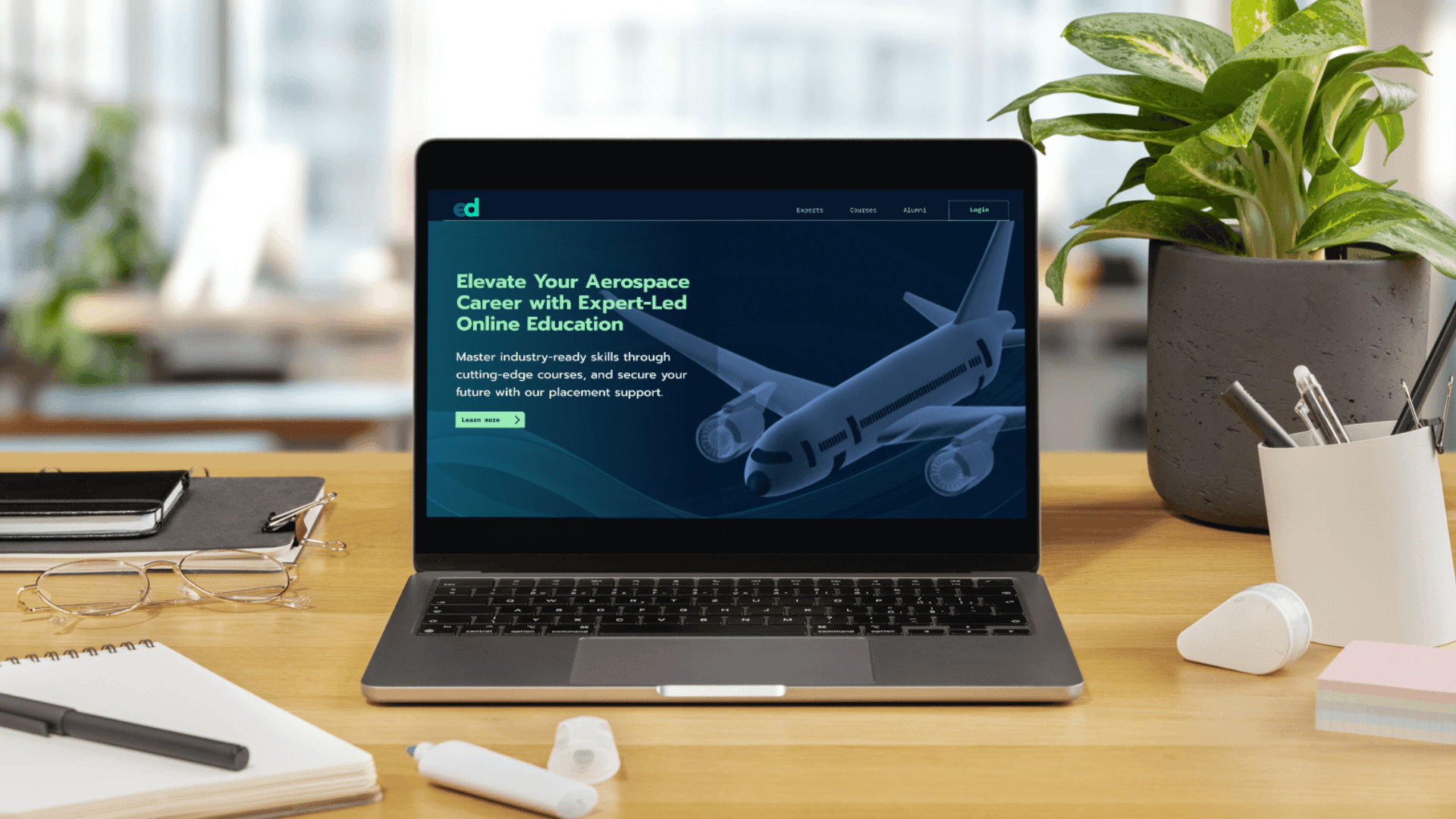
As the head of a design agency, Brainsauce, I collaborated with a client who had an ambitious vision: to create a fast, reliable, and intuitive digital knowledge base for physiotherapy practitioners and students, ensuring seamless access to essential assessment test information anytime, anywhere.
Client:
PT Assess
My Role:
Research, Design Strategy, UI/UX
Year:
2024-Ongoing
Service Provided:
App Design
The client approached us with a personal challenge: struggling to quickly find reliable sources for easily forgotten yet essential knowledge while attending to patients. She realized that this was a common issue among practitioners and students alike.
Physiotherapists often know these details, much like recalling how many planets are in the solar system- it’s basic knowledge, but not always instantly retrievable under pressure. Additionally, searching for procedural videos and test information online often leads to unreliable, scattered resources, making the need for a trusted, structured app even more critical.
Following the Double Diamond Design Thinking process as our guiding framework, we embarked on this project to uncover the most effective and user-centric solution for this challenge.

Double Diamond Design Thinking Process
To design an effective solution, we conducted extensive research focused on:
Common pain points: Identifying the key information practitioners struggle to recall during patient assessments.
User flow preferences: Understanding how users prefer to access information under time constraints and ensuring the app minimizes friction.
Exploring existing solutions: Studying existing resources to uncover gaps in reliability, accessibility, and ease of use.
Content consumption behavior: Determining whether users preferred quick video guides, step-by-step instructions, or interactive elements.
Trust & credibility factors: Exploring what makes medical professionals trust a knowledge source and how to build confidence in the app’s accuracy.
Our interviews confirmed the critical need for a quick-access knowledge base for physiotherapists. All 20 participants admitted to forgetting basic assessment details at some point in their practice, with 16 struggling with this frequently. One participant shared
This reinforced our decision to build a dedicated, structured app for instant, reliable access.
Other findings highlighted the need for step-by-step procedural guides, short instructional videos, and structured navigation to locate tests by specialization or category. A powerful search function and the ability to save frequently used tests were also key to efficiency. Above all, users emphasized the importance of expert-reviewed content, ensuring they could confidently rely on the app in real-time patient interactions.

User Persona
Following the research phase, we collaborated with the client to brainstorm and refine the essential features for the app. While many ideas surfaced, only the most impactful ones made it to the final selection, features that aligned with user needs and enhanced efficiency in real-time practice.
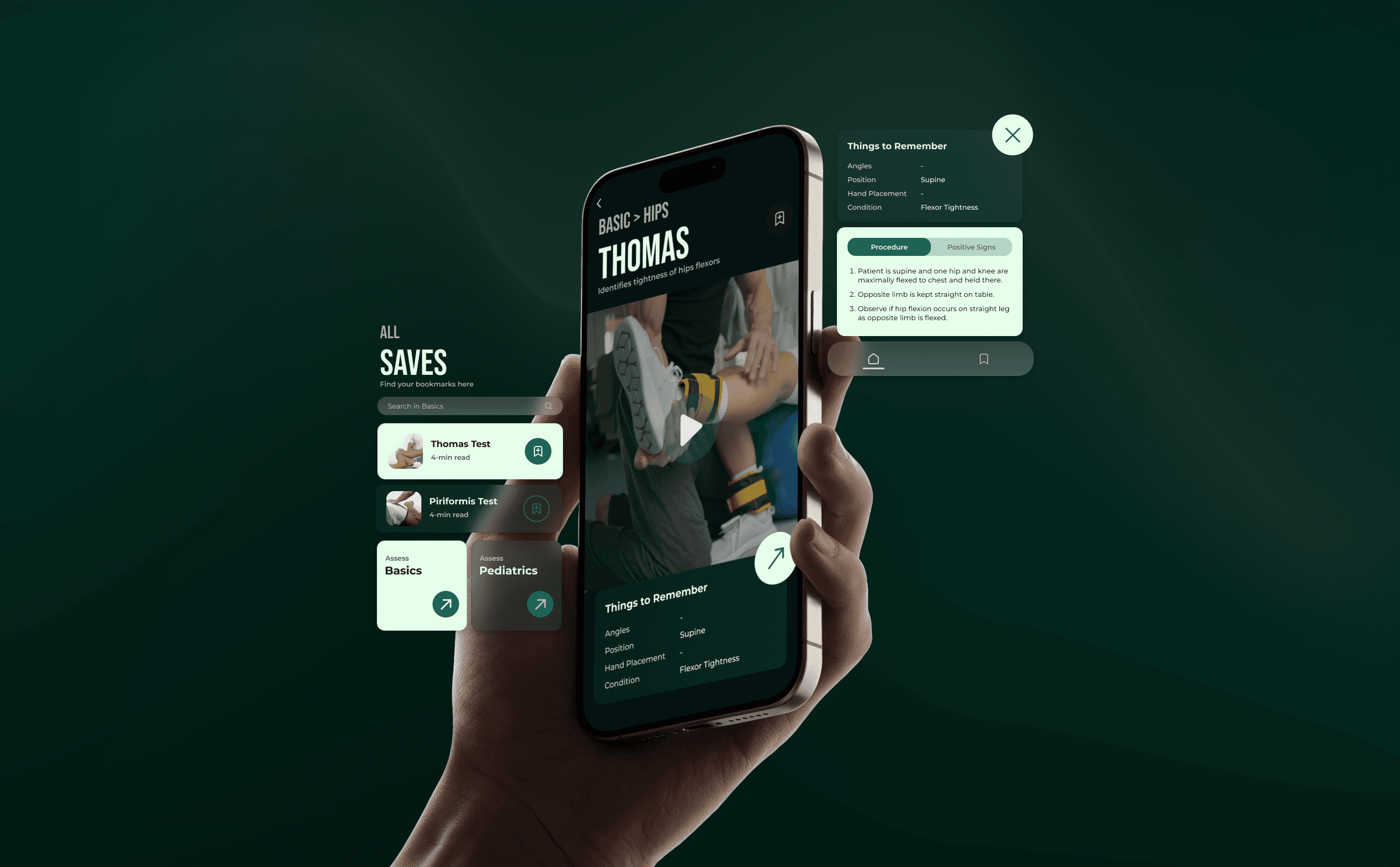
Finalized features: Specialty categorization, A-Z chronological categorization, saved collections, short-form procedural videos, step-by-step written procedure, written positive signs, aim of the tests, key facts section, easy navigation, search bar
By prioritizing usability, accuracy, and efficiency, we ensured that the app delivers a frictionless experience tailored to physiotherapy practitioner’s real-world needs.
The information architecture of our app is designed for intuitive navigation, ensuring seamless access to physiotherapy assessments. The structured flow guides users from the Home screen to categorized Test Areas, leading to detailed insights on each test. With sections for key facts, procedures, and instructional videos, the design enhances usability and efficiency.

User Flow & Infromation Architecture
Then, we translated our information architecture into rough wireframe sketches to bring the structure to life. These sketches helped us visualize the user journey, right from selecting a specialization category to exploring test details; before diving into the final polished UI.

Rough Sketch of the Wireframes
Using our information architecture and wireframes as the foundation for the app’s user experience, we collaborated with the client through branding exercises to refine the visual identity. The final prototype was designed with a modern, minimal, and professional aesthetic, featuring a dark UI theme for a sleek and focused user experience.