Creatives Club
Fostering creativity and inclusivity through strategic branding
As the head of Brainsauce, a design agency, I partnered with a client driven by an inspiring mission: to transform their cafe into a creative hub where freelancers, students, and professionals could connect, collaborate, and grow. The challenge was clear: to identify what the target audience truly needed and building a brand that could bring this vision to life while being welcoming to the creatives.
Client:
Kite Socials
My Role:
Brand Strategy, Art Direction
Year:
2024
Service Provided:
Branding and Visual Identity Design
Our client’s cafe wasn’t just about serving coffee, it was about serving ideas, connections, and opportunities. They envisioned a space where creativity could flourish, and people could find support, inspiration, and meaningful connections. The objective was to position Kite Socials as a hub that bridges the gap between aspiring creatives and the opportunities they seek, all while fostering a sense of belonging and shared purpose.
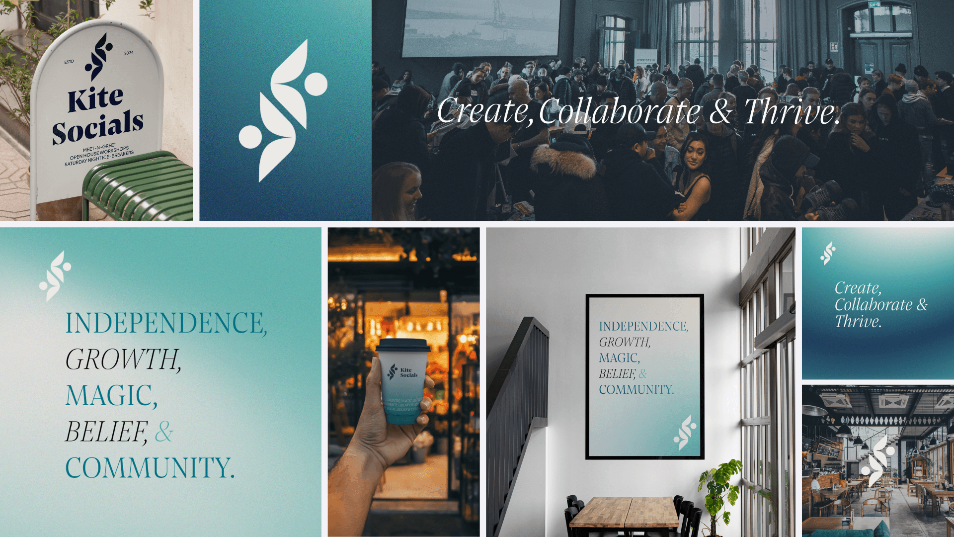
Glimpse of the final results
User Insights
We began by interviewing and surveying the three initial user groups: creative professionals, freelancers, and students and emerging creatives. This research revealed invaluable insights into their needs, aspirations, and challenges.
Key findings:
All users desired mentorship, networking opportunities, and a platform to showcase their work.
Freelancers and professionals sought collaboration and connections to grow their businesses.
Students craved guidance, constructive feedback, and exposure to industry opportunities.
The universal challenge: finding work or projects that matched their talents and ambitions.
The Gap
While these users could support each other through referrals and shared experiences, they lacked direct access to hiring managers or HR representatives.

Brand Strategy Process
Expanding the User Base
Recognizing this gap, we proposed adding a new user group: Corporate Clients: hiring managers, agency leaders, and businesses seeking creative talent. Through targeted research with this new group, we validated their needs: access to a talent pool, collaboration opportunities, and innovative ideas. This addition not only addressed the gaps for creatives but also made the community indispensable for businesses.
Client Alignment
Simultaneously, we worked with the client to clarify their values and goals. Through questionnaires, we distilled their beliefs:
Community and connection as the foundation of creativity.
The power of individuality and the pursuit of growth.
Celebrating creativity and the transformative power of belief in one’s potential.
From the insights gathered, we identified four pillars to shape the brand: Creativity, Collaboration, Networking, and Growth. These pillars aligned the needs of the audience with the client’s vision.
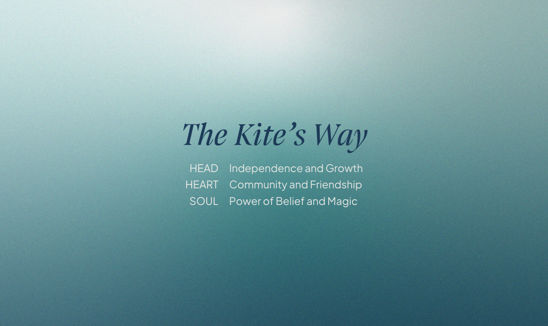
To further refine the strategy, we divided the brand into three core components of head, heart and soul. This structure informed not only the services Kite Socials would offer but also its voice and tone, which would be approachable, empowering, and inspiring.
As the Art Director, I worked closely with our in-house designer to translate the strategy into a compelling visual identity. This involved:
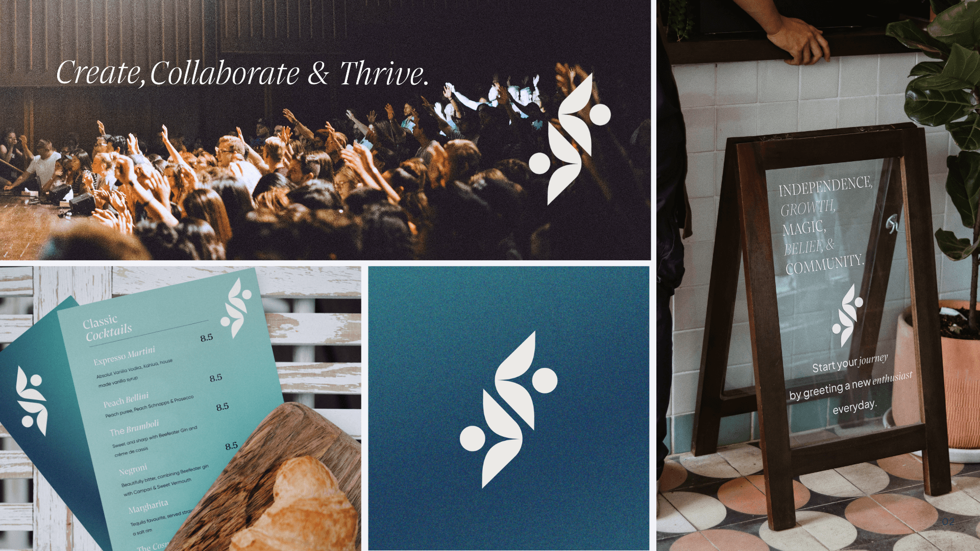
Logo Design: Two abstract figures shaped like a kite, symmetrically divided and facing opposite directions, symbolizing collaboration and interconnectedness.
Color Palette: A harmonious blend of bold blues, calming neutrals, and timeless contrasts, evoking warmth, approachability, and optimism.
Typography: A thoughtful pairing of the elegant and modern Flourish Text Pensum Display Italic with the bold and approachable Plus Jakarta Sans, reflecting creativity and inclusivity.
Imagery: Visuals that capture themes of connection, innovation, and collaboration.
Our guiding principles: approachable, inclusive, forward-thinking, and empowering, ensured the brand resonated with its diverse audience.
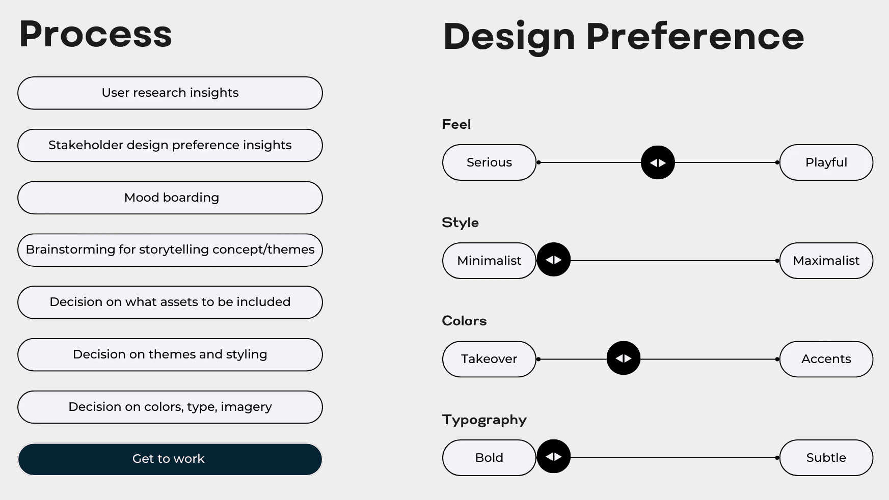
Process of building a visual identity
We brought the brand to life across digital and physical spaces, these were our deliverables:
Delivered comprehensive brand guidelines for seamless communication across all platforms.
Designed social media templates to strengthen Kite Socials online presence.
Created branded merchandise to foster community pride.
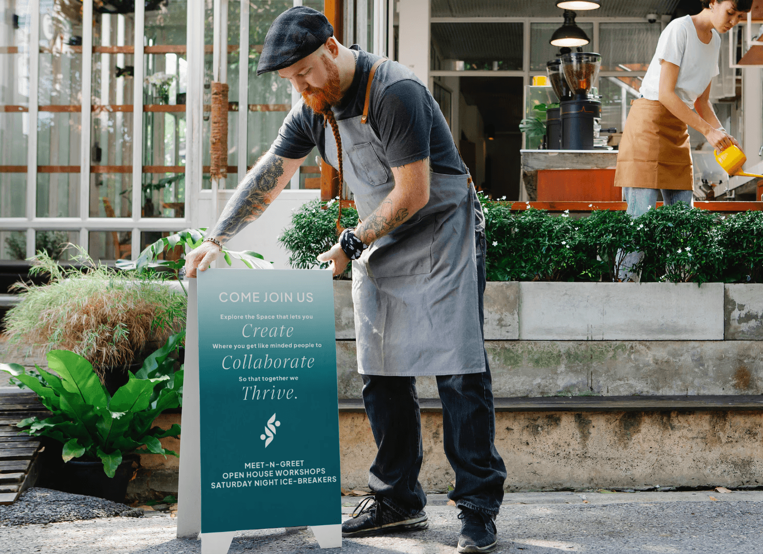
Developed consistent signage for the cafe, transforming it into an inviting creative hub.
